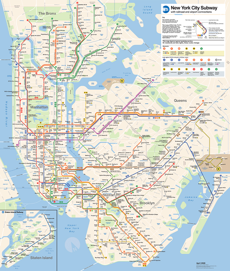
DESCRIPTION
I redesigned the New York City Subway map in the style of the Tauranac/Hertz map but constructed more strictly on a grid system. This was a personal project that I worked on (slowly) from March 2023 to April 2026.
BACKGROUND
The "great NYC subway map debate of 1978" has been discussed and documented at length. Check out any of those links if you haven't heard about it; it's fascinating. The central conflict was visual clarity vs. geographic accuracy.
I generally prefer the approach that John Tauranac and Micheal Hertz took. I think it's important to be able to understand the relationship between one's position in the system and the city around you. However, it's undeniable that the Tauranac/Hertz map is difficult to understand for newcomers to the system.
I imagine that this was one of the motivations behind the 2025 redesigned map done by an in-house team at the MTA, which takes an approach more in line with Vignelli's. I think this map is extremely successful with regard to understandability. I also think it strikes a better balance between visual clarity and geographic reality than Vignelli's map.
I was inspired to start this project when I first saw the Customer Pilot Map in person sometime in 2023. I liked it, but felt there must be a middle ground. My goal in designing my map was to "modernize" the map without losing the details.
PROBLEMS
Over the forty years the MTA used the Tauranac/Hertz map, the map slowly became more inconsistent. I can't pretend to know what happened, but my guess is that it got digitized a bit too early and the file just got ridiculous to work on. I say this because the map we had until 2025 was a bit of a mess.
The map changed a lot between 1979 and 2025. Click on any image to view it at larger.
I redesigned the New York City Subway map in the style of the Tauranac/Hertz map but constructed more strictly on a grid system. This was a personal project that I worked on (slowly) from March 2023 to April 2026.

BACKGROUND
The "great NYC subway map debate of 1978" has been discussed and documented at length. Check out any of those links if you haven't heard about it; it's fascinating. The central conflict was visual clarity vs. geographic accuracy.
I generally prefer the approach that John Tauranac and Micheal Hertz took. I think it's important to be able to understand the relationship between one's position in the system and the city around you. However, it's undeniable that the Tauranac/Hertz map is difficult to understand for newcomers to the system.
I imagine that this was one of the motivations behind the 2025 redesigned map done by an in-house team at the MTA, which takes an approach more in line with Vignelli's. I think this map is extremely successful with regard to understandability. I also think it strikes a better balance between visual clarity and geographic reality than Vignelli's map.

I was inspired to start this project when I first saw the Customer Pilot Map in person sometime in 2023. I liked it, but felt there must be a middle ground. My goal in designing my map was to "modernize" the map without losing the details.
PROBLEMS
Over the forty years the MTA used the Tauranac/Hertz map, the map slowly became more inconsistent. I can't pretend to know what happened, but my guess is that it got digitized a bit too early and the file just got ridiculous to work on. I say this because the map we had until 2025 was a bit of a mess.
The map changed a lot between 1979 and 2025. Click on any image to view it at larger.
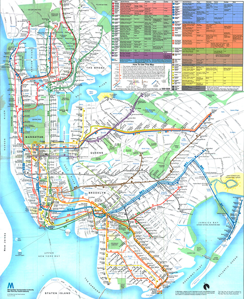
1979 Map
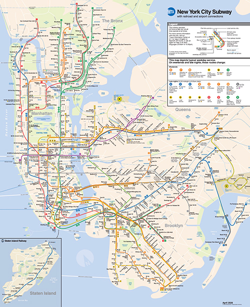
2025 Map
Other than the colors, the most noticeable change is the elimination of nearly all the connecting streets. I understand why this was done, as the old map was certainly very busy, but the streets that remain are oftentimes disconnected and leave vast areas of the map practically empty. Digitization also introduced a few other issues with the map.
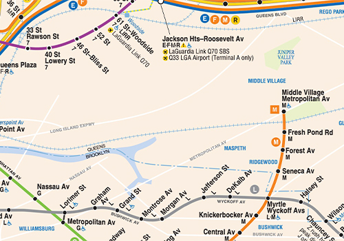
Queens south of Queens Blvd is a ghost town. Greenpoint Ave stops when it should continue straight onto Roosevelt Ave.
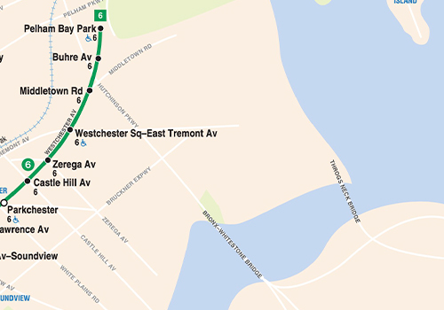
There's a similar story in the Bronx east of Hutchinson Parkway. The streets peter out, the Throggs Neck Bridge just doesn't go anywhere.
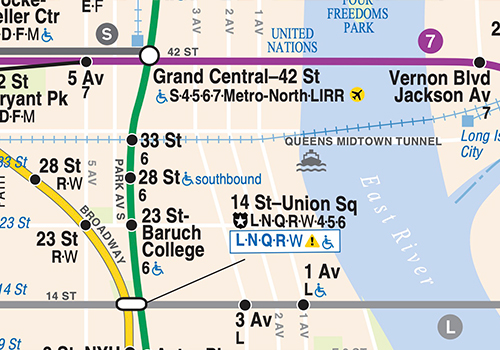
1st, 2nd and 3rd Avenues don't bend like that. Manhattan streets are otherwise generally accurately lined up though.
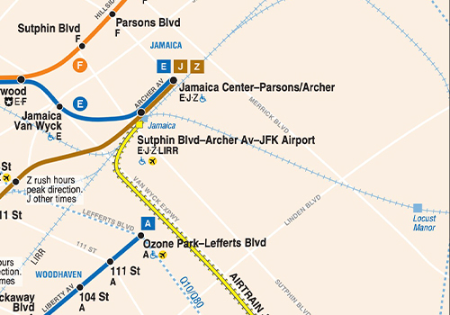
Locust Manor station should be on the other side of Merrick Blvd, which itself should be running more or less parallel to LIRR here.
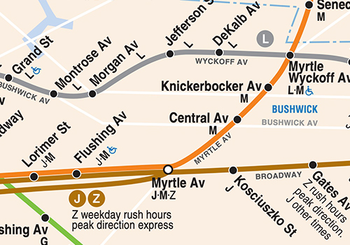
The curve of the M train just abruptly starting at Myrtle has always bugged me. Morgan Ave doesn't cross Newton Creek either.
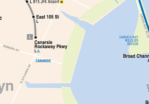
You're going to have to take my word that there's a whole lot more misalignment than this.
APPROACH
There were initially two mains goals for this project:
The first was to match the style of the existing subway map and to depict all the same information it depicts: express subway routes, commuter lines, bus lines, streets, parks, etc. This goal was mostly met, though I did diverge from the old map's styling for labeling parks and bodies of water. I also changed the typeface to Helvetica Now, which they tell me is better.
The second goal was to draw everything on a grid, using only 90, 45 and ~26.5 degree angles (that weird angle is what you get drawing a line one point up, two points over on a square grid). This goal was also mostly met, with a large exception -- the three angle rule, which I'll explain more in the following section. The map is still ~mostly~ drawn with those three angles and is ~mostly~ on a grid.
PROCESS
I started with Manhattan to see if what I was trying to do was even possible, assuming (I would learn incorrectly) that it would be the most difficult. I downloaded the current subway subway map from the MTA, lined up Manhattan's trunk lines roughly with a square grid and started plotting points on top of it. Initially, I wanted the trunk lines to be spaced symmetrically, but I quickly realized the reason the old map placed trunk lines where it did: it's the absolute minimum amount of space needed to fit in the station labels in midtown.
There were initially two mains goals for this project:
The first was to match the style of the existing subway map and to depict all the same information it depicts: express subway routes, commuter lines, bus lines, streets, parks, etc. This goal was mostly met, though I did diverge from the old map's styling for labeling parks and bodies of water. I also changed the typeface to Helvetica Now, which they tell me is better.
The second goal was to draw everything on a grid, using only 90, 45 and ~26.5 degree angles (that weird angle is what you get drawing a line one point up, two points over on a square grid). This goal was also mostly met, with a large exception -- the three angle rule, which I'll explain more in the following section. The map is still ~mostly~ drawn with those three angles and is ~mostly~ on a grid.
PROCESS
I started with Manhattan to see if what I was trying to do was even possible, assuming (I would learn incorrectly) that it would be the most difficult. I downloaded the current subway subway map from the MTA, lined up Manhattan's trunk lines roughly with a square grid and started plotting points on top of it. Initially, I wanted the trunk lines to be spaced symmetrically, but I quickly realized the reason the old map placed trunk lines where it did: it's the absolute minimum amount of space needed to fit in the station labels in midtown.
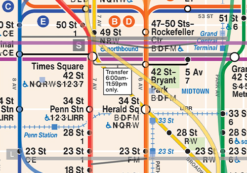
Comparison of the original map's lines (lighter opacity) and mine. My spacing of cross streets differs quite a bit from the original (and would continually change while I was working on the map), but the trunk lines have remained exactly the same.
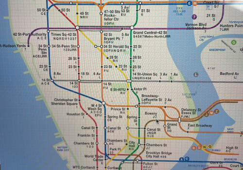
The first picture I could find working on the map, from April 2023. I had only worked on lower Manhattan and midtown. The landmasses are still copies from the original map.
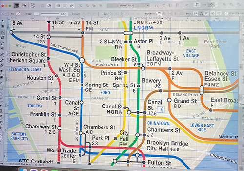
I soon started adding streets and neighborhood labels for Manhattan. But still nothing outside of that borough.
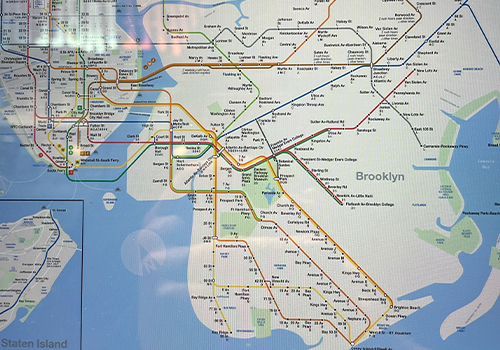
By February 2024, I had subway lines fully connected in Brooklyn.
After working on the map for about a year, I had laid out subway lines in Queens and started getting the roads down in Brooklyn. Then I accidentally deleted the file.
One day to save some disk space, I deleted the previous year's design folder from my laptop knowing that I had it backed up before. What I didn't know until a week later was that my working file was still in there -- it never got moved to the 2024 folder. I did have a backup, but it was from December 2023 and was missing all of my work in Brooklyn and Queens.
This bummed me out. So I gave up on the project for six months.
One day to save some disk space, I deleted the previous year's design folder from my laptop knowing that I had it backed up before. What I didn't know until a week later was that my working file was still in there -- it never got moved to the 2024 folder. I did have a backup, but it was from December 2023 and was missing all of my work in Brooklyn and Queens.
This bummed me out. So I gave up on the project for six months.
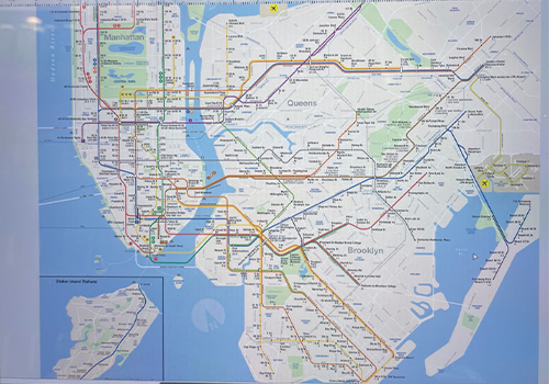
The last picture I took of the map before I deleted the file in May 2024.
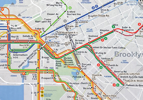
After some time had passed, I realized I could just plop that picture onto the backup file and trace over it. It turned out to be shockingly easy to do.
By January 2025, I had back everything that I lost, and I had finished placing lines, streets and labels in the Bronx. At this point, I posted a draft version of the map online asking for feedback. And feedback I got. I received tons of helpful suggestions, which I would begin to implement.
Separate from these suggestions, I was unhappy with the shape of the land masses, particularly the shape of lower Manhattan and Brooklyn.
Separate from these suggestions, I was unhappy with the shape of the land masses, particularly the shape of lower Manhattan and Brooklyn.
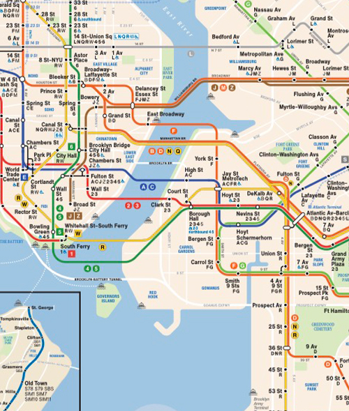
The map I posted in January 2025
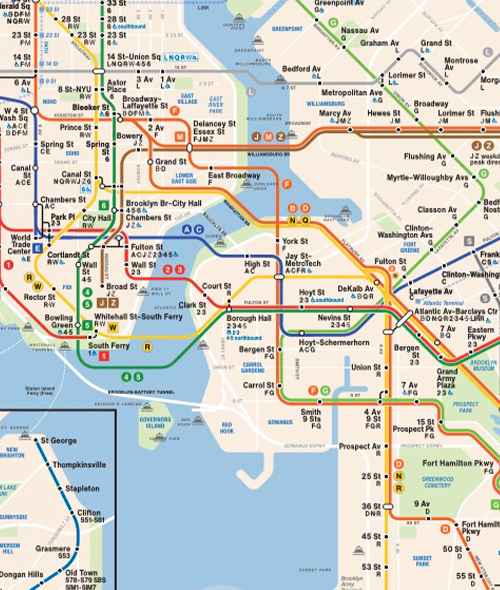
The map a few months later.
I also decided around this point to increase the number of angles that I would allow myself to draw. New York is a city of grids, and a lot of these grids line up in very odd ways. For my map to make more sense geographically, I'd need to incorporate more of this oddness.
As such, I went back over the map borough-by-borough and tweaked streets and shifted subway lines, experimenting with several new angle combinations. This process made all these features mesh up much better.
As such, I went back over the map borough-by-borough and tweaked streets and shifted subway lines, experimenting with several new angle combinations. This process made all these features mesh up much better.
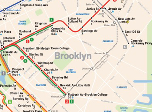
January 2025
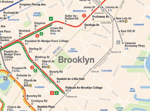
April 2026
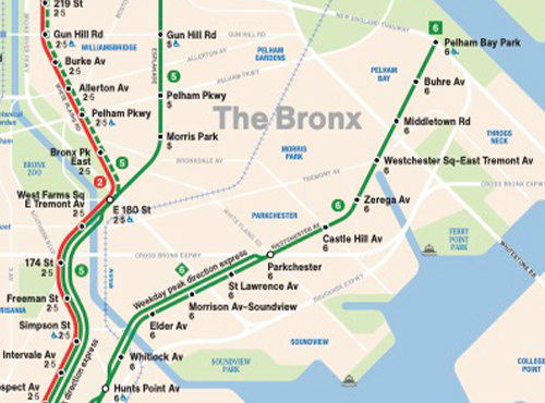
January 2025
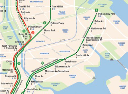
April 2026
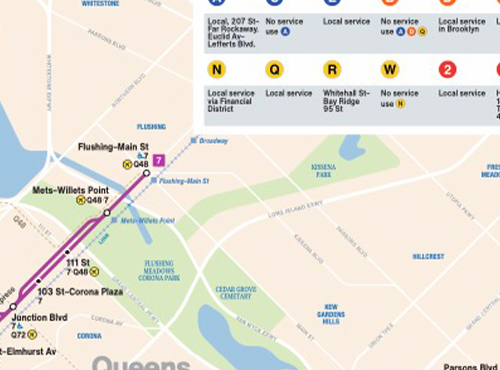
January 2025
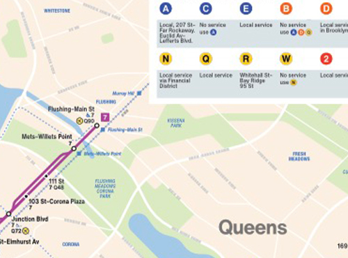
April 2026
With a few final tweaks in April 2026, I posted it online again. And once commenters pointed out my many spelling mistakes and I fixed them, the map was finally finished.
CHALLENGES
There were several challenges while creating this project. What follows is a nowhere-near-exhaustive list of problems faced.
Some difficult areas:
CHALLENGES
There were several challenges while creating this project. What follows is a nowhere-near-exhaustive list of problems faced.
Some difficult areas:
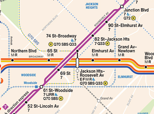
Jackson Heights and the surrounding area were very difficult to plot. A lot of elements converge here: the 7 train, the Queens Blvd line, two bus lines and the IBX. I've dealt with it imperfectly here. I drew Q70 SBS this way to emphasize that it only stops at the Woodside and Jackson Heights stops. In real life, it runs along Roosevelt Ave in one direction and Woodside Ave in the other. As a result, I also wasn't able to label the IBX stop here.
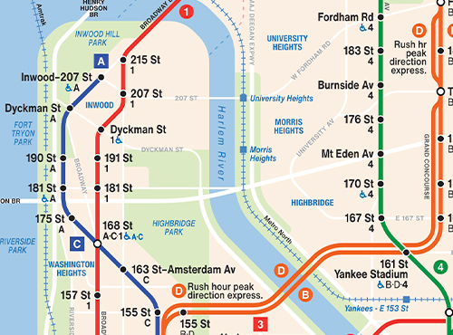
Because of how spread out the trunk lines needed to be in midtown, upper Manhattan and the Bronx are incredibly wide. The original map had this problem too of course, but I feel I took more liberties with east-west distortion in particular. In upper Manhattan, shifting the 1 train east towards the water would help remedy this. But to maintain the logic of the map, I needed the 1 train to hit Amsterdam Ave at 207 St, which fixed its horizontal position.
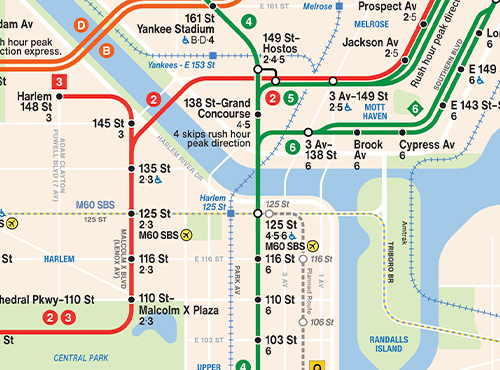
The Harlem River and upper west corner of Manhattan are also particularly distorted. Having the Harlem River run at anything more shallow than 45 degrees looked very off to me. I also don't love the right angle turn for the northwest corner of Manhattan, but it was necessary to make enough room for the Bronx.
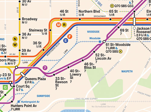
The 7 train in Sunnyside runs along Queens Blvd between 33 and 46 St and then turns onto Roosevelt Ave just before 52 St. I would have loved to have shown this, but it would look something like the image above, which just felt way too clunky. My solution to this was simply to not show the turn, which I don't like.
Some difficult streets:

18 Av/Ditmas Av/Ave D in Brooklyn
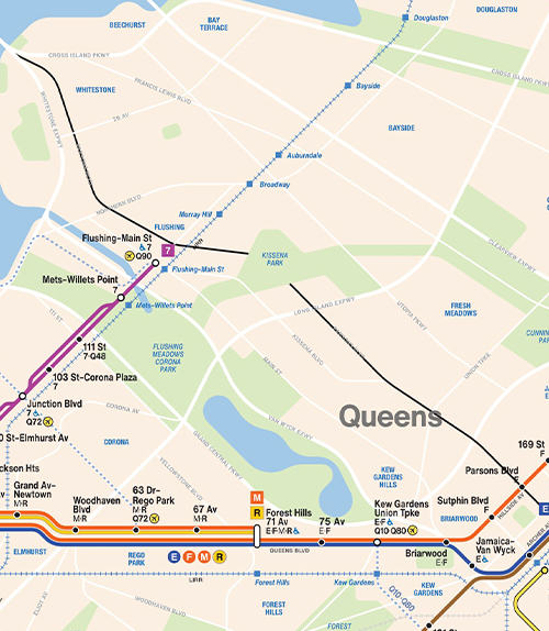
Parsons Blvd in Queens
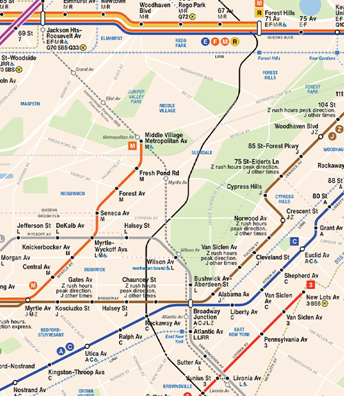
Yellowstone Blvd/Cooper Av/Rockaway Av in Queens and Brooklyn
CONCLUSION
I'm happy with this thing. I started this project not knowing whether or not what I wanted to accomplish was even possible. It took a lot of work to get everything here to slot together. And I'm proud that it does.
ADDITIONAL LINKS
Map with no Key
Map with no Labels
Comparison with Old Lines
I'm happy with this thing. I started this project not knowing whether or not what I wanted to accomplish was even possible. It took a lot of work to get everything here to slot together. And I'm proud that it does.
ADDITIONAL LINKS
Map with no Key
Map with no Labels
Comparison with Old Lines
